What’s the difference between home styling and the random placement of decorations in a home? When styling, you’re taking in consideration the seven elements of interior design – space, line, form, light, colour, texture and pattern. When these are accounted for, décor looks strategic rather than random. It enhances the space and creates dynamic aesthetics that work well with architectural specifics.
Styling a home like a home interior designer, isn’t easy if you don’t have some background knowledge and an eye for details. For a smaller apartment like a 2-room HDB BTO, you have the challenge of not creating cluttered mess while in a bigger 5-room HDB BTO, the challenge is to use the space so that the decor looks cohesive and not awkward.
There are various professional hacks that you can employ to give your home interior a boost that’s a reflection of your lifestyle and personality.
The Rule of Threes
This is a very simple and versatile rule you can use when styling every part of the flat. That’s why we’re commencing the list with this clever and incredibly effective hack.
Explained in simple terms, the rule states that objects look better in groupings of three.
If you have one or two items, they may appear somewhat random. Four or more will be fighting for attention. Hence, a grouping of three will be ideal, whether you’re decorating a coffee table or adding visually-intriguing items on a shelf in the entryway.
The easiest way to follow the rule is to create groups of three that contain matching sets of décor. For example, you can have a group of three pillows on the sofa. To make the grouping visually interesting, choose different sizes. Different colours or textures will also work well to make the grouping dynamic.
In case you don’t want matching objects, create thematic sets of three. For example, a kitchen arrangement of three could include a spice jar, a pepper mill and an olive oil glass container. These items aren’t the same but they have functional and thematic connections to each other.
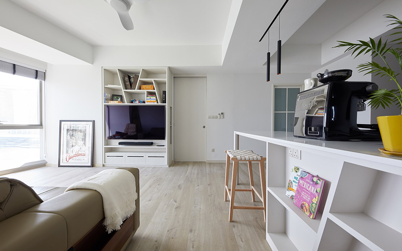
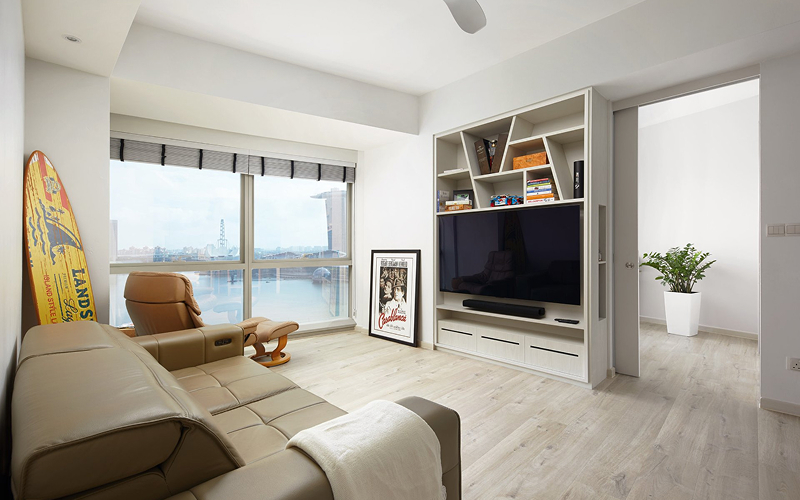
Placing Wall Art Correctly
Many people struggle with wall arrangements and making those look professional. Again, there’s a simple hack to achieve great results without having to work too hard for the perfect outcome.
The secret here is the placement of art at the correct height.
There is a magic number when it comes to hanging decorative pieces or art on the wall. That number is 150 centimetres from the floor to the centre of the respective item.
The number isn’t random. It puts a piece of art or a wall decoration at a perfect height for viewing. For most people, this will be ideal eye level, turning the wall décor into a focal point within the room.
When placing art on the wall, you can do a few additional things to achieve perfect results. If a decorative element is across from a seating area, make sure that it’s positioned a little bit lower. This way, the item will be easy to view and enjoy while someone is relaxing.
To put together a gallery wall, start from the largest element and create a grouping around it. The visuals don’t have to be matched or placed in a perfect line. We’ve already talked about a couple of good layout ideas and you’ll find those in the linked article.
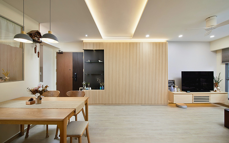
Layering Lights
Good home interior design is very much dependent on light. Proper illumination can make even the simplest elements shining stars. That’s why you should pay special attention to how lighting is being used in each room.
A professional hack to test out involves the layering of light to accomplish a couple of things.
Layered lights that are individually controlled can set the mood, provide sufficient illumination and create functional or decorative areas (depending on the intensity, the colour of the lights and the nature of the fixtures chosen to house those).
Most rooms will benefit from three types of light – general, accent and task lights. As the name suggests, accent lighting is used to point direction towards some of the most visually intriguing parts o the room – a piece of art, an antique piece of furniture. Task lights are functional in nature. Think about a reading light above a loveseat or lights under the cabinets to illuminate the kitchen countertop.
Having these three kinds of lights will set the right mood in the room, create a beautiful interaction with other décor elements and boost the usability of the respective space.
Scale and Size Considerations
We’ve already mentioned those briefly in the rule of three discussion. Different sizes and shapes create dynamic interiors that aren’t too neatly matched and sterile. Good (mis)matches, however, need to take into account scale and the size of the respective space in order to work.
Proportion and scale play a very important role in interior design. Large pieces in a small room will make it appear even more cluttered. Small and narrow pieces in a large space will appear lost and completely mismatched.
This is the most mathematical interior design rule but you can always trust your eyes and your gut when assessing scale and size.
If you need a hack – start with the rug. It grounds the space and getting its size correct will make it much easier to select other pieces that correspond to the specific dimensions.
A good size for a rug makes it partially fit underneath furniture. For best results, a rug should go underneath all four legs of a piece. When in doubt, always go bigger. The only exception is the instance in which you have a beautiful decorative floor. Solid wood or delicate marble need to be visible and you can go minimalist with carpets in that situation.
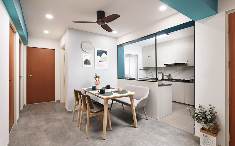
Window Treatments, Rugs and Textured Fabrics
A final hack to tie everything together focuses on the power of textiles.
Don’t make fabric selection an afterthought.
The right textiles can add cohesiveness to a room and make it feel a lot cosier. Some of the most pronounced textiles include the window treatments and carpets. Don’t skip on the curtains or decorative blinds – they provide an easy opportunity for the décor to shine.
A general rule of thumb here is to hang curtains high and wide. If you do so, you’ll open up the space. According to professionals, such a placement gives the illusion of more space, allowing even the smallest of rooms to breathe.
As far as selecting the right fabric, it’s really up to you. Textured, heavier fabrics add a sense of maturity and sophistication to the interior design. Lighter ones look more youthful and bring some modernity in the space.
Carpets and rugs are also fun to use when attempting to add a textured element. A shaggy rug will instantly boost the comfort level. On top of that, the texture will create an effortless point of visual interest. After all, the focus doesn’t always have to be on the wall and it most definitely doesn’t have to be a piece of art.
These are just a few of the hacks that professional designers count on to make spaces look modern, perfectly tailored to the needs of the flat owner.
If you want to benefit from a professional touch of a trusted home renovation contractor in Singapore, contact Home Guide now. Home Guide has a team of trusted and experienced home interior designers who will work with every single architectural element to polish the interior of your home and give you beautiful home you never thought you could have.