Archives: Projects
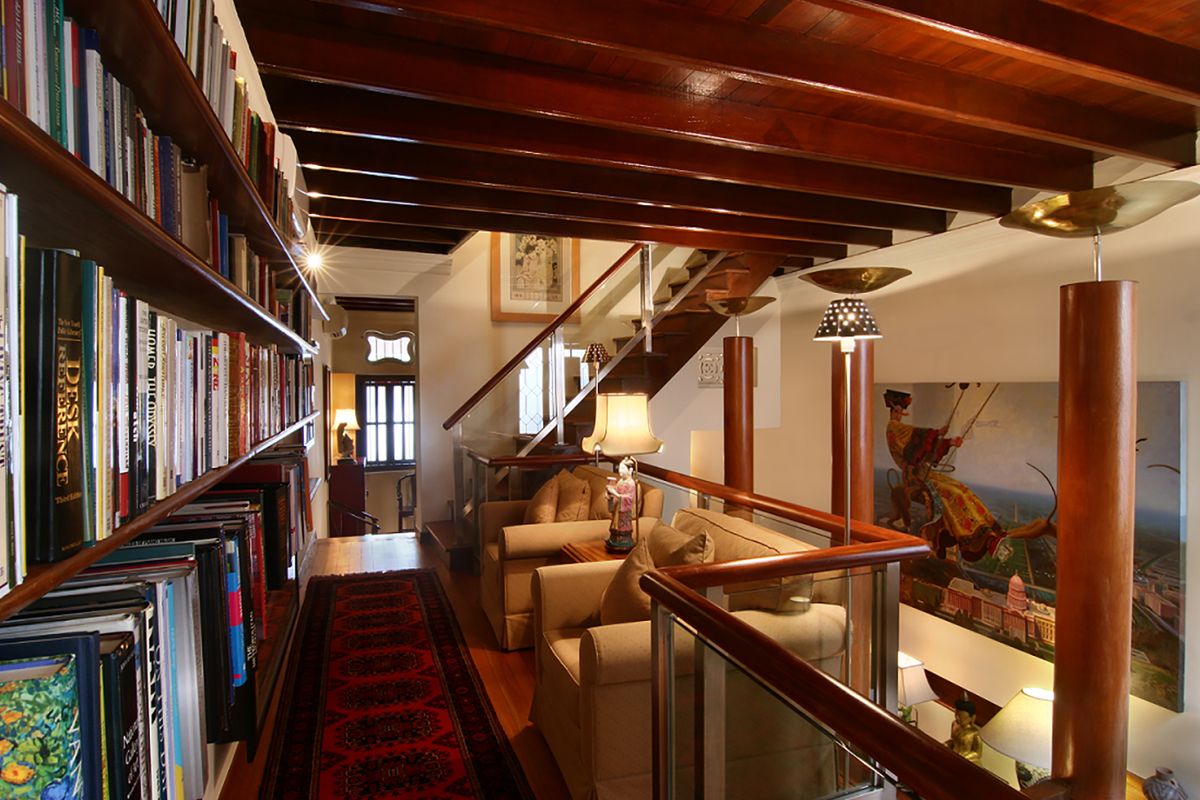
Emerald Hill
Home Guide was brought in with an interior design brief to create an elegant home for the clients and their extensive collection of books and art. A double story building with a mezzanine running the length of one side, lighting and groupings were used to divide the space visually into cosy nooks and gathering areas. The existing strong timber detailing, in the Peranakan architecture of the building, was artfully incorporated into the aesthetic, with all of the elements coming together as a cohesive sophisticated whole.
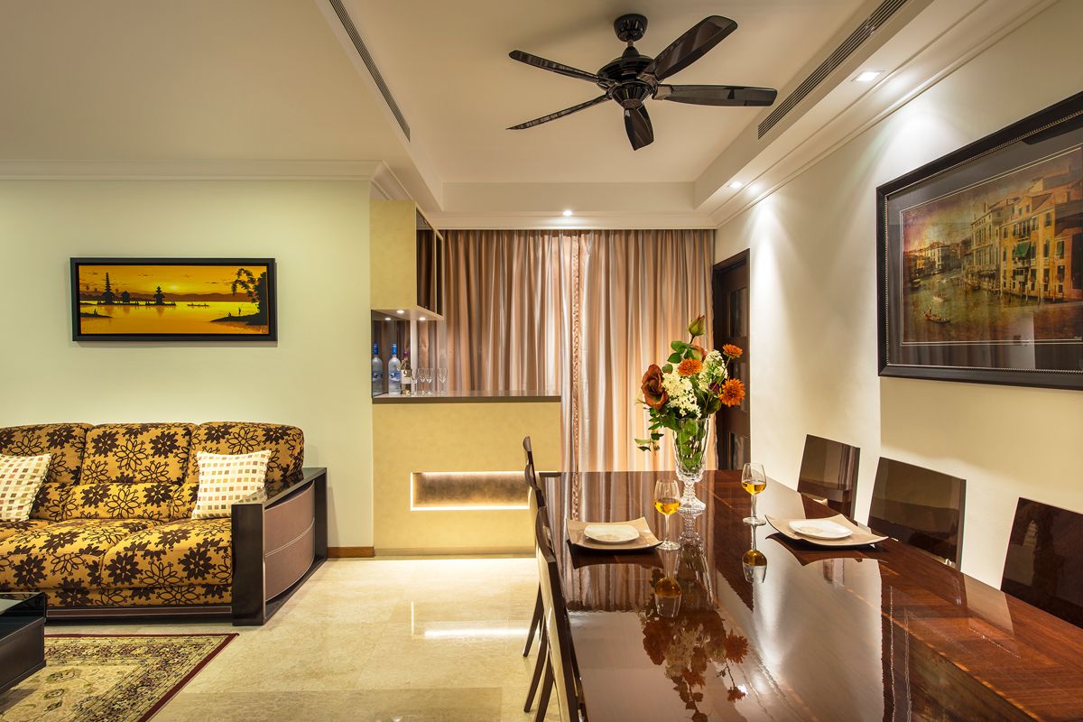
Camelot by The Water
A 4 bedroom condominium in Tanjong Rhu has been re-designed by Home Guide to create an inviting, luxurious space. The marble floors were already in place when the apartment was bought, which provided inspiration for elements that were added throughout the condominium interior design process. The designs and furniture selection were made to exude inviting warmth to all who enters the home.
The intention was to create a space infused with classic and sophisticated style. Starting from the cream marbled floors, Home Guide created a palette of rich browns and ambers. The dining area invites one to step up to the glowing crème leather bar for a light aperitif before taking a seat at the exquisite brown granite dining table. The other spaces in the home were designed with equal careful consideration and the whole home is a beautiful example of Singapore interior design.
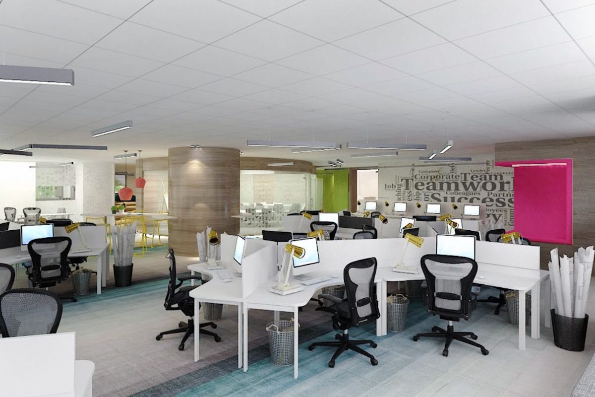
AIG Building Software Company
A friendly and interactive space was created to enhance creativity and efficiency in the workplace. The workspace takes on a more open concept instead of the the boxy convention, making it more accommodating to the contemporary corporate life. The colour scheme is vibrant and the furniture design is made user friendly.
The client is a successful Software Company that specializes in Web Design and Development. As such, they required the interior design of the office to be highly collaborative and inspirational. The workspace needed to be designed in a way that will foster idea generation and collaboration from the employees. The team took all these requirements to heart and created an office space that is imaginative, original and efficient.
The actual layout of the interior design is extremely open and flexible. The space has no physical boundaries and the design was built on the concept of ‘agile offices.’ The office interior space is made to show no inclination of a rigid hierarchy system. Every aspect of the interior has been carefully crafted to enhance the creation and sharing of creative and innovative ideas.
From the contemporary materials to the soothing colour scheme and lighting, each area has been carefully designed to create the friendliest corporate environment. Even the furniture is extremely user friendly and could be customized to the users’ preference.
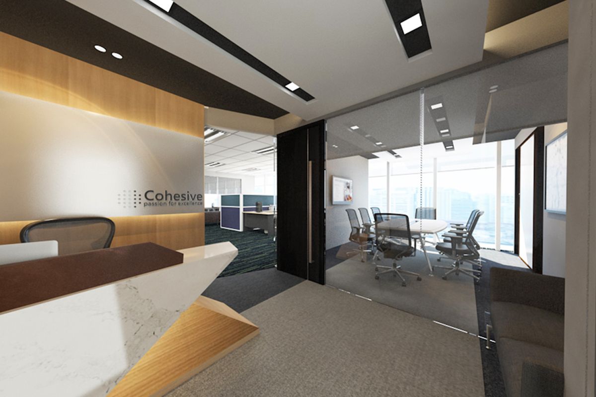
Cohesive Shipping
A 30 year old freight and shipping company, Cohesive Shipping, needed an interior design concept for their new 1400 sqft office space in Raffles place, Singapore. The design concept had to be one that was representative of the company’s distinct prominence in the industry and one where the company’s professional corporate identity can be appropriately reflected. Through employing intelligent space planning accompanied by the existing magnificent view that the office oversees, the overall design of the office is further enhanced.
On the 15th floor, the new office was a blank space with fantastic full height windows that oversees the Clarke Quay area. The brief for the design of this office renovation in Singapore was to create an open concept to establish a pleasant work space for the employees. The office also required a large, well equipped meeting room and private offices for the two directors. In addition, the reception area of the office had to be one that not only provides a sophisticated entrance to welcome clients but one that introduces Cohesive Shipping as a company.
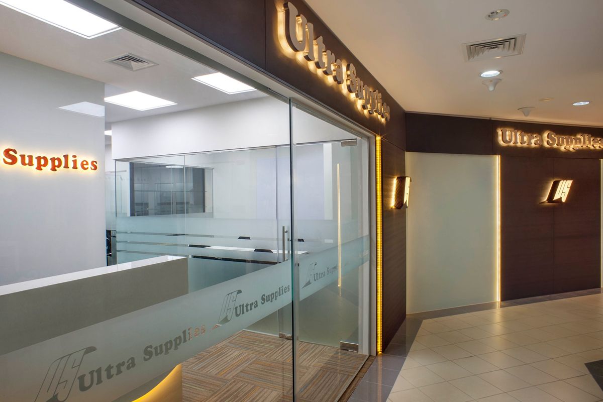
Ultra Supplies
Set in the Queensway Shopping Centre, this office space needed to be re-designed to stand out from the competition and portray the company’s position as one of the leaders in the industry. The existing space of 1000 square feet needed to be carefully considered, to allow for the 20 staff members and private offices for the executives. The result brought about by Home Guide is a sophisticated and bright example of an office interior design in Singapore.
Established in 1977, Ultra Supplies needed their existing store to be transformed. The space was cramped and dark, making it difficult to accommodate all their staff. Home Guide was asked to recreate the layout to comfortably fit both open concept desk layout, storage space and create individual spaces for the executives.
Space planning would be the key feature in succeeding with the interior design concept while keeping to the regulations of Fire Safety Authority. The offices have been recreated to become brighter and more spacious, creating a more pleasant work environment for all of the employees. The design concept is fresh and clean, with a clear corporate identity.
The first change was on the façade. To visually separate Office Supplies from their competitors whom are on the same level of the centre, a sophisticated dark brown panelling was used, against which the yellow backlighting of the signage could stand out. The combined effect of the materials is a modern introduction to a cutting edge company.
Dental Surgery Clinic @ NeWest
This dental clinic has a contemporary aesthetic, a modern ambience and a functional layout. The planning was prioritized to facilitate the workflow and professionalism of the dental clinic staff. Specialty spaces like the X-ray and consultation rooms needed to be designed very precisely in order to contain the radiation and to fit the equipment inside the rooms respectively.
The client requested for an interior design that prioritizes on the ambience of the reception and waiting areas will maintaining the privacy of the consultation rooms. The idea was to create a balance between the function of the space and its aesthetics. Piping for the suction and water tools had to be especially retrofitted along with the machinery for dental procedures. The workflow has to be creatively considered and applied. The ambience had to give a spacious but clean feel that would put the patients at ease.
Home Guide’s Work
After an in-depth consultation, a computerized 360°Tour was created and shown to the clients. After approval, Home Guide’s team took two combined storefronts and designed a creative layout plan that secured the privacy of the consultation rooms while leaving ample space for the reception and waiting. The interior of the consultation rooms followed an all-white colour palette, which is usually associated with cleanliness. The procedure chair upholstered in bright colours serve as a dash of colour to balance out the ambience of the consultation room. The X-ray room walls were install with lead to keep the radiation inside.
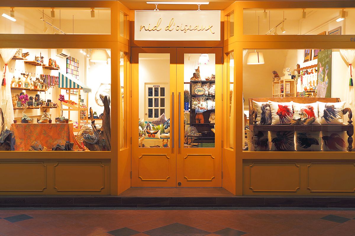
Nid D’oiseaux
Nid D’oiseaux is a cozy store that specializes in antiques and other handmade objects. So the interior design concept of this outlet was to feature all these products in the best light. The overall design was therefore simple and understated – a backdrop for the actual products on display, but still snazzy enough to keep any customer hooked on the ambience. This store was also chosen by Starhub to be used in their Christmas advertising campaign.
The client used to be a resident in France, and was deeply inspired by the delicate neo-renaissance aesthetic of the City of Light. The interior design of this retail outlet was requested to be done in a classy and sophisticated way – something that was trendy but not overwhelming. So the ambience was crafted to be posh and understated with a dash of restrained glamour.
As in any retail, the display was to be given special consideration. This resulted in a bright white color scheme that would definitely make the handmade gifts and decorations pop.
The design team paid special focus to the product display. Nid D’oiseaux is a concept lifestyle store that promotes an artisanal way of living, so each product has to be the focus of display. This means that the backdrop was relegated to crisp, understated tone of white that make all the handmade gifts and decorations the focal point of this interior.
Additionally, the ambience was inspired by the delicate elegance of contemporary French interiors and nature. Since there are no shopping malls in the area, the shop exterior has to be paid special attention. Its bright yellow exterior is reminiscent of beautiful sidewalk boutiques.
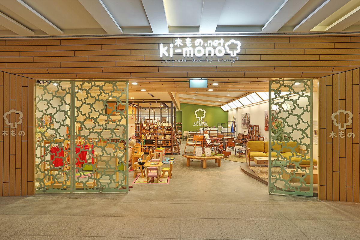
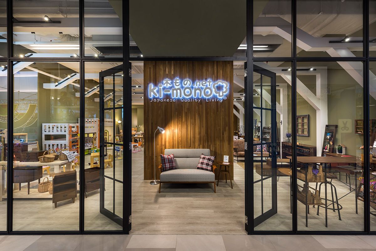
Ki-mono @ JEM
Ki-mono, meaning Wood-Things, is a brand that aims to bring Japanese design to Singapore. Home Guide created a space that reflects the Japanese heritage of the designs, but showcased in a comfortable, home-like environment that would help the customer imagine the design pieces in their own home. Having successfully designed the Ki-mono store in OneKM, Home Guide approached this space with a fresh outlook, again managing to create a welcoming, Zen space.
Inspiration for the overall aesthetic was to be taken from a traditional Japanese home, creating a bright store with a Zen feel. It was important to show the Japanese element of the designs and display them in a way that translated seamlessly into a Singapore interior design.
When designing the OneKM store, the aesthetic had a subtle Japanese feel and it was a great success. So, when designing the store at JEM, a more literal approach was used and a Japanese home was created with an aesthetic sensitive to the products, highlighting them throughout.
Ki-mono @ OneKM
Located in the stylish OneKM Mall, Ki-Mono (meaning wood-things), a Japanese furniture design store, was looking for a complete re-design of their showroom. They found the existing space too open, hence lacking of flow. It also lacked a clear representation of their brand, which was to allow clients to identify the Japanese heritage behind their designs through a warm and inviting space.
Home Guide Design was thus invited to re-design the store and they have successfully created a space that is both stylishly Zen and functional in telling the story of the product; a perfect balance of Japanese and Singapore interior design. The client was very pleased with the outcome that Home Guide Design has delivered and they requested Home Guide Design to take on their third retail store at JEM.
The initial floor plan of the store was too open, with no clearly defined shop front. Customers could access the shop from all sides, making it difficult to devise a walking path to ensure that they saw all of the products. This was the first issue that was addressed by enclosing the shop with distinctive black-framed glass. This created a physical barrier, but kept the shop open visually.
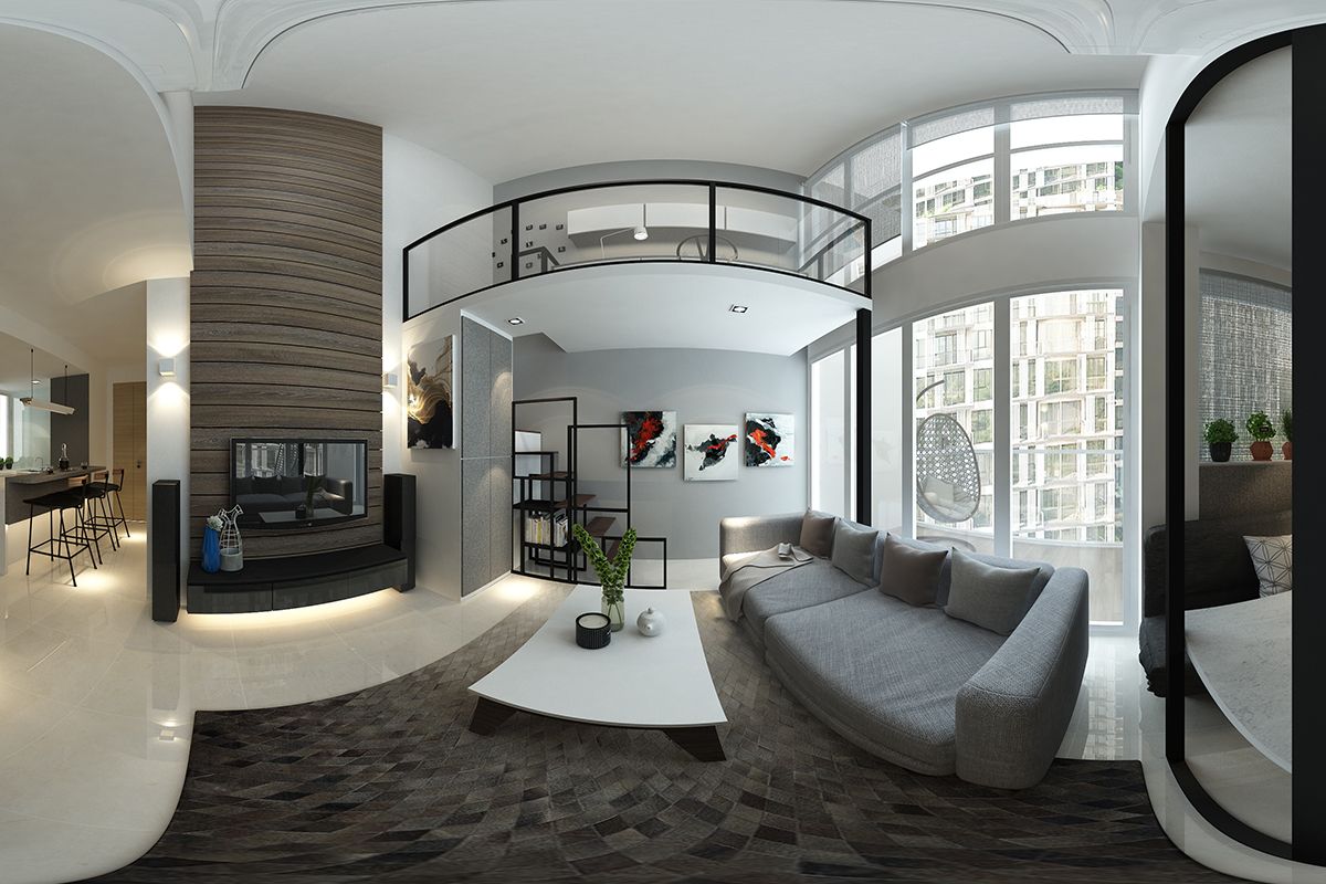
HomeAlive 360° Design Package
HomeAlive 360° Design Package
Bathroom 360° View
Before Discount:
$200
After 50% Discount:
$100
Bedroom 360° View
Before Discount:
$600
After 50% Discount:
$300
Kitchen 360° View
Before Discount:
$800
After 50% Discount:
$400
Living Room 360° View
Before Discount:
$800
After 50% Discount:
$400
Living Room 360° View 2
Before Discount:
$1200
After 50% Discount:
$600
HomeAlive 360° Design Package prices are 100% waived when you engage our interior design or renovation services.
How It Works
Stage One
- Layout plans are created (Approx 2 – 3)
- Detail and elevation drawing proposal
- Material and colour scheme proposal
- Ceiling and lighting plan proposal
- Estimated quotation
- Finalisation of above plans, proposals and quotations
- Proceed to 360° 3D drawing
Stage Two
- Proposal of 360° 3D perspective drawing
- Amendments to proposed 360° 3D perspective drawing
(Limited to one set of amendments) - Final 360° 3D perspective drawing