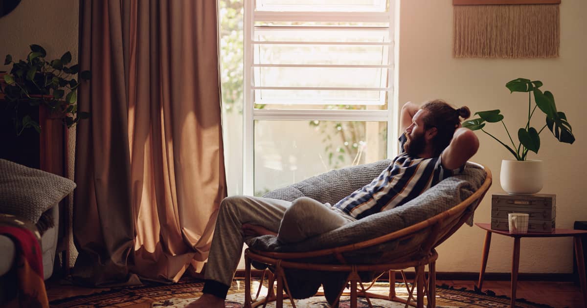
Bright, exciting, bold, delicate – colour can be used to convey so many emotions and have a striking impact in the world of home décor. Just like other aspects of interior design, colour has seen massive transformations through the years. What was considered especially refined and trendy a decade ago is already frowned upon by the most popular and sought-after interior designers today.
Colour trends have changed for various reasons – lifestyles, social and cultural trends, functional considerations. Let’s check some of the popular colours of the days gone by and the reasons why they were considered such an attractive option.
The Decadence of the 1920s and 1930s
Art deco was at its height during the 1920s and 30s. With it came lots of luxury, elegance and sophistication.
As far as colour schemes were concerned, they prioritised bold and saturated rich tones. Yellows, cadmium red, jewel tones like purple and jade green dominated the home décor landscape. These were the decades during which bright colours capable of making a powerful statement were embraced unconditionally for the first time.
The 1920s and 1930s were linked to growth, economic prosperity and stability. All these important socioeconomic factors got reflected in home décor choices. Just think of The Great Gatsby and the lush home interiors featured in this masterpiece. You’ll quickly get a detailed visual of the prominent interior design elements, as well as the colour schemes chosen to accentuate and enhance all of the opulence.
Practical Naturalism during the 1940s
The prosperity and lavishness of the 1920s and 1930s came to an end in the 1940s. War and the crises linked to it changed the general outlook on life and the way people approached their home décor.
During the 1940s, primary and natural colours gained a lot more prominence than the lavish tones that were adored just a decade ago.
Muted colours and traditional, practical colour schemes came to the forefront of interior design and home decorations. Greys and other neutral tones started popping up in homes across the world more frequently, as well.
The 1940s were a sombre period for humanity and the prominent colours of that decade stand as living proof of the claim.
Regaining Optimism in the 1950s
The end of war brought on new sentiments and a wave of optimism that swept across the globe to transform the solemn mood of the decade gone by.
People started dreaming big and daring to consider the creation of their dream home. Most were hoping for long-term stability and as a result, they were prone to invest in brand new furnishings and décor pieces.
Colours were chosen to set a positive tone and enhance mood at home.
Splashes of pink, orange, blue and mint green all gained popularity. Home owners and designers also gained the courage to experiment with more eclectic colour palettes and choices that were considered a big no-no in the interior design rule book before.
The Hippie Revolution of the 1960s
This decade is the one that saw the most dramatic change in colour trends from beginning to end.
Interior designers believe that the 1960s didn’t have a prominent colour scheme of their own. That’s because the decade was characterised by lots of turbulent change. The hippie movement had a definite influence and the same applies to the “mod” sub-culture. Vibrant shades, even confrontational colour choices were embraced to create unique, outstanding and sometimes even shocking home decors.
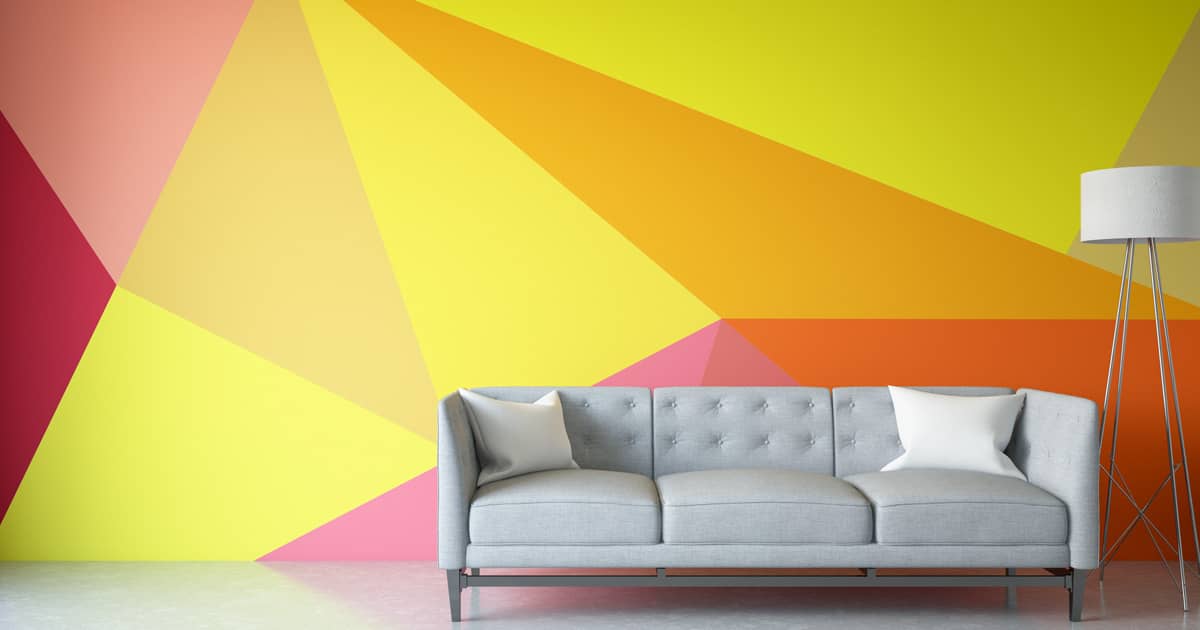
One thing is clear – all of the colours from this decade are bright and unapologetic. As far as particular tones being prioritised over others, pinks, greens, blues, purples and neons were all highly present.
All Natural in the 1970s
The desire for closeness to nature influenced colour scheme selections throughout the 1970s.
Some of the most prominent tones utilised in home décor over this decade include greens, yellows, beiges, muted oranges, browns and pastel blues. People started rejecting the “synthetic” look of many bold colours that used to dominate interior design a few decades back. As a result, interior designs started appearing a bit more tame and balanced.
Shining Bright in the 1980s
One word that can be used to describe the colours of the 1980s is contrasting.
The natural, gentle tones disappeared and bold choices replaced those docile colours. Fluorescent colours, neons, metallic tones and textures – all of those got embraced to make a statement and celebrate life.
The 1990s and 2000s: A Little Bit of Everything
Just like it has happened before in history, the 1990s caused a complete shift from the boldness of the previous decade. The contrasting, aggressive colour choices were replaced by more natural and functional palettes. Natural tones, especially those of the forest returned to a world that had become increasingly urbanised and hectic.
Through the 2000s, people continued experimenting with all kinds of combinations. Neutrals paired with a bolder accent tone, eclectic designs, colour explosions – all of those got embraced.
Today, interior design colour palettes can be anything you envision. From the gentle and romantic to the aggressively unorthodox, you have the freedom to choose whatever makes you happiest.
We’re here for this freedom and we’re eager to become a part of your home transformation journey. Contact Home Guide right now if you’re considering an interior design upgrade and you’d like to benefit from the approach of highly experienced and reputable professionals.