Be it a cosy apartment or a spacious house, aren’t we all on the quest to make our diminutive spaces appear larger? Nevertheless, while embracing the latest trends, it’s all too easy to stumble into design pitfalls which inadvertently make our rooms seem more compact than they genuinely are.
Would you believe that one such prevalent misstep is the incorrect selection of colours – those that possess the ability to shrink your space perceptively? Join us as we delve into the intriguing world of the most space-shrinking colours – could these be the culprits you need to keep at bay for that desired visual expansion of your residence?
Here’s a nifty tip— if you have a room that’s a little too large and you’d like to render an intimate, snug ambiance, unfurling these colours might be just what the design doctor ordered!
Saturated Reds
Ever thought about adding a bit of drama to your living spaces with bold colours? Red might just be your answer. Just a touch can infuse any room with a vibrant jolt of energy, keeps it feeling lively and exciting. However, be forewarned!
Red, intriguingly, has the power to make spaces feel rather snug, almost enclosed. This effect is particularly pronounced with intense shades like brick red or maroon. These daring hues have this unique knack for ‘advancing’ towards you, leading to an intimate, cosy vibe, albeit in a space that feels notably more compact.
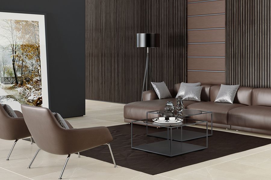
Earthy Browns
Ever thought about precisely what happens when you paint all walls of your room in earthy and dark shades of brown? Interestingly, it evokes a charming yet slightly imposing semblance of a cave. More so, these colours have an uncanny knack for absorbing light and cleverly shrinking a space, making it feel quite cosy, or potentially, a bit too confined.
Should you find yourself yearning for a breezy and spacious ambience, you might want to reconsider your palette. Why not try lighter shades of brown? Consider options like taupe or beige; they’re notorious for their light-reflecting abilities and big-room illusions.
Intense Greens
Have you thought of bringing a touch of nature into your home with green hues? Generally, green is a colour that exudes tranquillity. However, opting for dark or intense shades can indeed be a game-changer. Such shades can engulf the light, stealthily weaving an illusion of a more compact space. Imagine the deep, embracing tones of forest greens or olives shrinking your space subtly.
If you’re aiming to keep your space voluminous yet calming, might we suggest lighter shades? A dabble of mint or sage could, in fact, evoke that perfect balance of openness with a soothing undertone.
Heavy Oranges
Ever flirted with the idea of transforming your room into a snug, inviting nook? Deep hues such as luminescent oranges and, at times, radiant mustard yellows, could very well be your magic charm!However, let’s tread with caution. Swathing these strong, brave colours across large areas (think the walls), could awaken the colours’ uncanny ability to loom forward. This spawns a rather fascinating illusion where you’d almost believe that the walls were daringly edging towards you.
But, if your heart yearns for a room that breathes out an airy, expansive vibe, our pro tip would be to lean towards milder shades. Think along the lines of a gentle peach or a creamy yellow. These charmers can visually amplify your room, casting an irresistible “open” spell!
Charcoal Grays
Have you ever noticed how charcoal grey and other darker hues can make a room feel somewhat smaller? The reason for this lies in their ability to absorb light. Rather than bouncing light back into the room, these shades soak it up, casting a dim and cosy ambience that ultimately creates the illusion of a more condensed space.
But don’t fret, neutral-lovers! We understand your keenness for daubing your homes in various shades of grey. If you’re as fond of this sleek colour as we are, might we suggest a compromise? Try using lighter shades of grey on your walls and reserve the richer, darker greys for accents and accessories. A balance between light and dark could just be the design solution you’ve been seeking!
Colour Selection is Crucial in Home Interior Design
Ask a trusted and well-experienced home renovation company and they’ll tell you how important colors are in the overall feeling and ambiance of your space. In fact, there are several colors that can impact your mood negatively! So, we recommend being mindful while choosing your colour palette.
If you’re looking for a professional interior design company in Singapore to help you through the process of choosing colors— we’re just a message away